Holy shit, I love Wikipedia. I use it a ridiculous amount of the time (and so does everyone else – it’s the 5th most visited site in the world).
I also love Wikipedia because they kick ass at fundraising.
They have a huge advantage (all of that web traffic!) that they use to test and hone their ask. I had the pleasure of hanging out with the Wikimedia Foundation online fundraising team a few months ago, and in addition to being super lovely people, they gave me a look under the hood. And sweet jeebuz, they sure do like to test.
In fact, they test more than anyone else I know – by a long shot.
One thing their intense testing schedule exposed: some of the old fundraising rules just don’t apply to them.
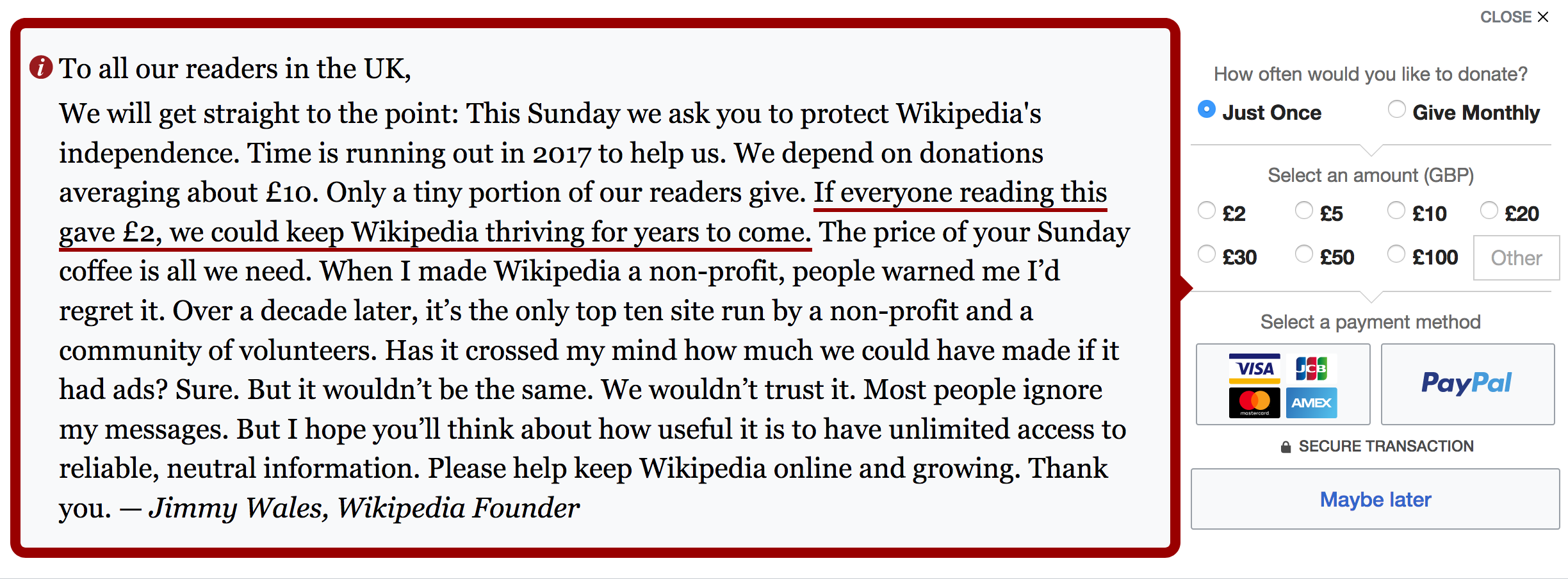
Check out their current (winning) banner:
So much in here is totally contrary to current wisdom:
The banner is so intrusive
It’s massive. It’s obnoxious. It’s the definition of an interruption.
The negative social proof
It’s EVERYWHERE. ‘Only a tiny portion of our readers give’, ‘Most people ignore my messages’. What the shit!
I remember reading a post from fundraising legend Jeff Brooks back in 2013 explicitly calling out negative social proof in fundraising, even backed up by some science. Wikipedia clearly didn’t see it.
A ‘Maybe later’ button in the form
Everything I’ve read on optimising donate forms has recommended minimising distraction – anything that will take you away from the purpose of the form (read: hitting ‘Donate Now’).
(Clicking the ‘Maybe later’ button lets you enter your email address, and then you get sent an email reminder later on – it’s a very nice flow).
Look at all those options in the gift array
EIGHT choices.
Anchoring the ask lower than the average donation
At just £2!
(I’ve also had great success anchoring even lower – just £1/$1/€1. Always performed best in tests).
No actual question
There’s no ‘could you please donate now?’-type typical ask. There are a couple of statements (‘We ask you to protect Wikipedia’s independence’ and ‘Please help keep Wikipedia online and growing’) that feel conventional, but they’re not underlined or made more prominent in any way.
In fact, the only thing that stands out is this sentence, that’s like the parent-who’s-hoping-you’ll-read-between-the-lines (your room would look much better if it were clean you know): ‘If everyone reading this gave £2, we could keep Wikipedia thriving for years to come.’
lol – brilliant.
It’s a huge blob of text
And it’s not super easy to skim (except for the underlined bit!)
They’re also doing a bunch of stuff that’s totally best practice (the ask is a personal message from Jimmy, their text is huge and easy to read, and they know *exactly* what’s resonating with their audience).
All of this has come about through hundreds of rounds of refinement, down to the exact language, button placement, donation choices – the lot. Everything that you see there has been tested and is totally optimised to maximise their income.
And to me, it’s just a huge reminder to test everything – especially the conventional wisdom – because the rules might not apply to you. We’ve all got different audiences, and for you, the unconventional might just work out.
Just in case you couldn’t love them any more, they’re also super transparent about their fundraising – how they bring in money, what they’re testing, and when they’re rolling it out, how they spend their donations. It’s all available on the Wikimedia Foundation’s fundraising wiki page.
Love it, love it, love it.
So get testing.