Hey {firstname}, these are the best email openings

Hey {firstname},

Some nerdy types did analysis of over 300,000 emails to see which common email openings had the best response rate. And it really goes to show that this stuff is seriously worth testing out:

Using a more casual greeting (like hey/hello) had almost 10% higher responses than “Dear”. And as the article highlights, a more formal greeting is typically used when there’s less shared context or if people don’t like each other – which isn’t great if you’re looking to build trust with your supporters.

Interestingly enough, just including an opening (any opening at all) generally increased response rate.

The team at Quartz include this very helpful insight, too:

Before you toss “Dear” in the dustbin, keep in mind that the data we analyzed may not be representative of email data at large. Online communities tend to be more informal, so you might find a different distribution of openings, and different response rates across them, in more formal settings. The same research also showed that participants in online communication tend to mimic each other in the formality of their writing. So keep your audience in mind when you’re starting to write a new message.

So, remember who you’re talking to. You know your audience better than anyone (hopefully) – but if in doubt, test it out!

Link Bonanza

I’m doing the web equivalent of a compilation tape for the post today, mostly because a whole bunch of really important stuff has just been released and there’s no point in drip feeding any of it.

So without further delay:

Announcing: Blueprints for Change

You know what sucks? Talented people and organisations who are unable to access the resources they need to achieve progressive change.

Blueprints for Change is a collaborative project that compiles knowledge and field-experience from a global network of campaign innovators.

It then makes this knowledge accessible to as many progressive organizers and campaigners as possible to help everyone “up their game” more quickly.

The Blueprint guides are completely free and open for anyone to download and use.

You can also read how lessons from Blueprints for Change on distributed organising are being applied in real life here on the Mobilisation Lab blog by Tania Mejia of Jolt in Austin, TX.

Full disclaimer: I’m fully involved in this project, and proud to be.

M+R’s benchmarks report has just been released

This is always choc-full of super useful and interesting info. If you’re serious about digital and doing it right, you need to read this and see how you compare.

There are a million top takeaways, but the big one for me: Mobile saw a 50% increase in its share of online transactions.

Digital = mobile. Mobile = digital.

(Just as a side note, the site is slick af too)

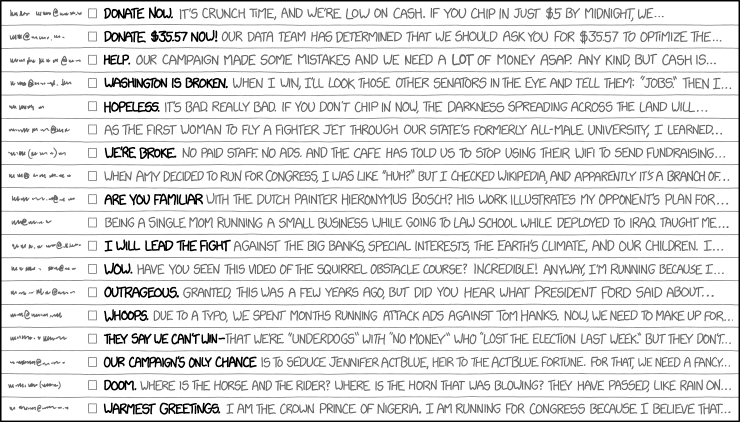
The next generation of American givers?

Blackbaud just released its report into the next generation of American givers, and check this out:

Two big big takeaways from this for me:

  • Boomers account for more than twice the amount of revenue as the civic generation. Boomers are also HUGE online donors (the majority of your online donors are almost certainly Boomers).
  • Gen X accounts for more revenue than the civic generation. They’re even more technically savvy than Boomers and have different demands from nonprofits than civics.

Essentially: a huge shift to digital isn’t going to happen — it’s happened. There’s a whole generation of new organisations out there eating the lunch of the big, more established charities, because they can see the shift in demographics of donors – and their demands, and are nimble enough (or have the right culture) to react.

Check out the report here.

One other side note: did you know the oldest Millennials are now 38 years old?!

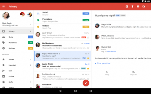
Top campaigning trends also just released

And last but definitely not least, the great people at Mobilisation Lab also released their campaigning trends for 2018 report.

Like all of the above, it’s a doozy.

And one of the emerging trends: the rise of mobile, especially in terms of messaging apps.

Why care what’s happening in campaigning when you’re in fundraising? Well, this article demonstrates that some of the best innovation happening in our sector right now is from small and nimble campaigning groups.

That’s it for now!


P.S. just a reminder — I’m doing a full day digital workshop at the Western Canada Fundraising Conference in Vancouver in just a few weeks. It’s top value for money (and you get to go to Vancouver!) – all those details are here.

Google just announced a huge change for email

Classic Google… just like that, what seems like a small announcement has the potential to shake up the way all of us do email fundraising and campaigning.

On the face of it, Google is making things a lot easier.

People will be able to interact with you from within the gmail app on mobile without having to go to a new webpage. Especially if you’re asking for donations, this has potential to be a game changer.

Check this out:

The AMP for Email feature will allow you to do things like RSVP to events, browse and interact with content, or fill out forms without leaving an email. For example, Google says if a contractor wants to schedule a meeting with you but isn’t able to see your calendar, they’ll contact you about availability. With AMP for Email, you could respond interactively through a form without ever leaving the email client.

The vast majority of your donations online will be driven through email (it’s how Obama, Bernie, and Labour in the UK made most of their cash!) so potentially having a donate form with pre-filled name and credit card details within the email itself is really really big.

So this means huge opportunities: more engaging email and higher action rates, purely because people won’t have to leave their inbox to take action with you.

But it’s not all fun and games – it could provide some major challenges.

It’s planning to make the changes through its AMP (accelerated mobile pages) tech. AMP has been called a “blight on the web” and coming to email is largely being called a bad idea and a power play by people that know things about the internet.

Just getting technical here: to use AMP means adding a third MIME-type to emails, which most email service providers don’t offer.

For non-techies: you’d need to create a unique email just for Gmail.

It’s still early days – I’m looking forward to seeing how this actually rolls out.


Unsubscribes aren’t always bad

Unsubscribes from emails are one of those metrics bosses love to measure (and flip out over).

Don’t freak out too much about people unsubscribing from your list. Establish a baseline unsubscribe rate, and then just make sure it doesn’t get too high.

In fact, you should think seriously about actively unsubscribing anyone who’s been inactive* for 3 months or more.

Here’s why actively unsubscribing people from your list is good:

  • You’ll get fewer spam complaints
  • Your deliverability (number of emails hitting inboxes) will stay in good shape
  • Your email performance should increase, since the people on your list actually want to be on there

And remember: sometimes unsubscribes – like complaints – can be a sign that your fundraising is kicking ass.


*By inactive, I mean people who haven’t even opened an email from you.

The perfect email template

I get asked what the perfect email template is all the time.

My response? Keep it simple, and keep testing. 

And then MailChimp comes along with their giant data science team. They’ve just gone and published their findings on what makes the perfect email template. They have a lot of data to pull from: millions of accounts sending billions of emails (*ahem* including mine, if you’d like to sign up).

I love me some data-driven decision making! Especially from outside the nonprofit space.

Their results? There isn’t any one winning email template, it depends on you and your list.

But there were two key principles:

Keep it simple

Use a basic layout, and keep your copy concise.

Keep testing

MailChimp’s findings also show that the best performing email lists tested constantly. Testing was THE indicator of high performance.

They found the best email lists:

  • Use their own data – they didn’t assume what works for everyone else works for them too
  • Challenged their assumptions – they didn’t just accept someone else’s best practices as the final truth
  • Never stopped testing – successful design was about figuring out what worked for THEM and refining it.

Check out the full MailChimp blog post here.

Testing is so important*. Still looking for a New Year’s resolution? Resolve to test everything, all the time.


*Here’s my testing how-to guide to get you started.


A solid gold time saving tip

I’ll let you in on a solid gold tip. This could save you tons of time and make tons of cash: test last year’s fundraising winner again this year.  

This is true for all channels.

If it’s an email, test sending the message to the test audience again as a reminder. You could try with or without a little topper. Or with a reply-style subject line (re:) vs. a new one. So many options. If that works, try sending a third time.

You just might have a winner on your hands again this year, for very little work.

This article covers some of the main arguments in favour of repetition pretty well, but here’s a quick summary:

  • Most people didn’t even notice you sent anything (think of how many marketing messages you’re getting at this time of year)
  • People aren’t paying attention to you UNLESS you repeat yourself. Repetition is one of the key drivers of success in for-profit marketing comms!
  • If a handful of people are complaining, develop a plan just for them (and remember, complaints can be a good thing)

One last tip: remember to focus your efforts right now on what will give you the biggest bang for your buck. Got an email list that responds well? Active Facebook community? Focus there first.

Buttons are good – use them

Buttons are an excellent way to get people to click and take action.

If you’re not on your work computer right now, you’re almost certainly reading this on your phone.

Most of your online stuff is being looked at on mobile phones right now.

You need to make it easy for people to take action. So put in a massive button when you want someone to do something.

Your supporters, especially donors, are older than you think – “young” donors right now are aged between 50 and 70, and we’re getting a lot better at using bigger fonts. But then we go and use text links or radio buttons all over the place and our sites look super 90s.

Put big buttons in to help out. And test out where to put them in.

Like this (don’t click any of them though, they don’t go anywhere):

No excuses: test your email fundraising appeals

Most of us are entering crunch time right now, and will be flat out emailing our supporters until the year-end.

You have no legitimate excuse to not test* how well your email fundraising appeal will perform before you send it to everyone on your list.

Here’s a simple process I tend to use when I’m testing out emails:

  • Write two or three different emails
  • Send all three at exactly the same time to a small part of my list – enough to get a statistically significant result
  • Project which one will perform the best**
  • Test the top one or two again to a bigger audience to make sure it wasn’t a fluke (and ditch the worst performing one)
  • Send to the full universe

Here’s the thing that’s painful but WILL make you a better fundraiser:

Don’t send anything that doesn’t meet your minimum baseline. Go back to the drawing board and try again until you get it right.

Don’t send anything that isn’t inspiring people into making donations to you. In direct mail, you usually find that out too late – but there’s no excuse for having an under-performing email.

Here are some starting points of things you could be testing:

  • Subject lines (and this should be every single time as a bare minimum – I’ve seen good subject lines getting 8 times as many donations as the worst performing subject line. And remember, you’re looking for the best action rate)
  • Lede – is there something in the news that’s relevant to you and giving your appeal some urgency?
  • Images
  • Email layout (buttons!)
  • Language
  • Suggested donation amount

There’s a lot more you can experiment with, but these will give you the best bang for your buck.

You owe it to the people your organisation is set up to help to get this right.


*I wrote a big testing guide and posted it the other day – check it out here.
**I’ve got a post on its way about how to do this too.

Great email from Movember

I just got a pretty decent email from the Movember Foundation asking me to sign up again this year (to be fair to them, they sent it over a week ago – it was more that I only just read it).

It looks like a personal email – check out the format, the subject line, and the initial tone. It’s got his email signature with a phone number in it. In fact, I thought it was a personal email until I saw the ‘view online’ and ‘unsubscribe’ links at the bottom.

Personal is great, especially if you’re making a high-bar ask.

There are a couple of things I would’ve done differently:

  • Had a reply-to address that looked like his actual email address (even if it wasn’t)
  • Made the tone more casual – this still felt like a promo email once I got past the initial introduction line
  • Put the ask in a lot earlier
  • Re-sent (kicked) the email a few days later

I’ve tested an almost identical personal approach before and it performs really well, but it needs to be on something where you’re asking for something a little *more* than normal.

Try adding this to your next testing cycle.

By the way, I did Movember back in 2011 when I was living in Canada. Here’s the horrendous result:

Yeah, I know.