Best practices for online fundraising (part 1)

Best practices for digital fundraising are a funny thing to define.

Digital is relatively new and changing all the time – even just defining ‘digital’ is changing*. Because of that, best practices for online fundraising aren’t prescriptive**.

So here you go – my no-bullshit, non-definitive list of best practices for digital fundraising that (shouldn’t) rapidly go out of date:

1. Test. All the time.

I yammer on about testing for a reason: it’s the single best way to figure out how to engage with your audience and send them stuff you’re doing that they’re interested in too (and want to support!)

I wrote a testing guide, and there are lots of ideas for testing all over this blog.

There are a few things personal to you to make testing work best:

  • Be open to learning new stuff
  • Test your assumptions
  • Be OK with it being wrong, just learn it quickly
  • Actually change how you do things

2. Go to where your audience is

Find out who your key supporters are*** and then do some research on where they are online and how they use the internet.

Go for the low hanging fruit – focus your resources accordingly. Find out where you’re getting the best return, then test and optimise.

It’s almost 100% guaranteed they have an email address if they’re under 65 – and they’re checking it regularly. So building an email list probably makes sense.

If you’re in the UK, 82% of 45-54 year olds use their mobile phone to access the internet (65% of 55-64 year olds do too) – that’s significant, because odds are your online donors are aged between 45 and 65.

And top three things they’re doing online: checking email, searching for information on goods and services (how’s your website?), and looking at social media. That key age cohort is just as likely to use the internet for social media as they are to do their banking.

So it’s up to you to figure out what social media they use. If they’re on Facebook, go there. If they’re on Instagram, go there. You get the picture.

Remember this most of all: Use smart data to figure out where you should be putting your efforts. And then test!

3. Send good content when you have good content

I want to emphasise good content. Because you’re testing all the time, you’ll figure out what that is based on what’s resonating with your supporters (track actions to actually figure out what people like).

Here are some good ideas to help start you off:

  • Rapidly respond to things that are affecting you, especially stuff in the news (your equivalent of disaster funding!)
  • Let supporters know how you’ve spent/are currently spending their money
  • Give people a sneak peek behind-the-scenes – and it doesn’t need to be super-pro (probably better if it’s not)

Test what’s resonating with people.

Edit: Here’s another way to approach it from Jeff Brooks that I like

4. Make it as personal as you can

People love the human touch, and they love that you’re not just a robot.

There are lots of opportunities to add the personal touch – especially through email or social media when it’s SO easy to reply in real time. The Women’s March showed the potential of Messenger bots in being able to provide a personal experience to people online without necessarily needing a person involved.

And just because I’m talking digital, it doesn’t mean you have to keep your communication in the online space (even if their donation came in online).

Try calling, or hand-written cards, or anything else that’s been working for you in fundraising so far. And test out ways to do that same kind of personal touch in digital ways too (e.g. texts, IMs, video… so many choices).

**********

Finally, a reminder: the single best thing you can do is test.


*Until fairly frequently, mobile was being chucked in its own category (hint: it’s digital)

**Beware anyone who tells you otherwise, especially consultants

***Don’t know? Ask them!

And check out the Office of National Statistics (UK) website for up-to-date internet stats. Tons of gold here.
Unsubscribes aren’t always bad

Unsubscribes from emails are one of those metrics bosses love to measure (and flip out over).

Don’t freak out too much about people unsubscribing from your list. Establish a baseline unsubscribe rate, and then just make sure it doesn’t get too high.

In fact, you should think seriously about actively unsubscribing anyone who’s been inactive* for 3 months or more.

Here’s why actively unsubscribing people from your list is good:

  • You’ll get fewer spam complaints
  • Your deliverability (number of emails hitting inboxes) will stay in good shape
  • Your email performance should increase, since the people on your list actually want to be on there

And remember: sometimes unsubscribes – like complaints – can be a sign that your fundraising is kicking ass.


*By inactive, I mean people who haven’t even opened an email from you.

The perfect email template

I get asked what the perfect email template is all the time.

My response? Keep it simple, and keep testing. 

And then MailChimp comes along with their giant data science team. They’ve just gone and published their findings on what makes the perfect email template. They have a lot of data to pull from: millions of accounts sending billions of emails (*ahem* including mine, if you’d like to sign up).

I love me some data-driven decision making! Especially from outside the nonprofit space.

Their results? There isn’t any one winning email template, it depends on you and your list.

But there were two key principles:

Keep it simple

Use a basic layout, and keep your copy concise.

Keep testing

MailChimp’s findings also show that the best performing email lists tested constantly. Testing was THE indicator of high performance.

They found the best email lists:

  • Use their own data – they didn’t assume what works for everyone else works for them too
  • Challenged their assumptions – they didn’t just accept someone else’s best practices as the final truth
  • Never stopped testing – successful design was about figuring out what worked for THEM and refining it.

Check out the full MailChimp blog post here.

Testing is so important*. Still looking for a New Year’s resolution? Resolve to test everything, all the time.


*Here’s my testing how-to guide to get you started.


People are weird and will lie to you

People are outwardly mostly normal. But if you scratch the surface, pretty much everyone out there is kinda weird. And with that weirdness comes a degree of unexpected behaviour.

This isn’t anything new. Anyone that’s been doing fundraising for a while knows just how strange donor behaviour can get.

So we try and mitigate the weirdness the best we can by asking donors what they like, in the form of surveys and focus groups and stuff like that.

But people are damn dirty liars and won’t tell you the truth.

They don’t *mean* to lie to you. People legitimately just don’t know what they want or like.

A few years ago I was at a conference where a really big UK charity was talking about how they surveyed their mid-level donors about the kind of images they were using in their fundraising. A couple of donors had made comments (not even sure if they were complaints?) and so they wanted to understand if it was a bigger problem or not.

And then I listened in horror when they said they’d just swapped the images out based on what the donors had said in the survey. No testing.

The donors had picked images they *thought* were good – and would make them look like good rational people too. All crap: pictures of scientists doing research, some lab photos, that kind of hyper-rational stuff that makes sense on the surface. All because a couple of comments (come on people, sometimes complaints are good!)

Everyone will give with their emotions and will rationalise it later on.

It’s why the SPCA’s Sarah McLachlin ad and ones like it are so good.

Don’t get me wrong here. Surveys, focus groups, interviews – all of that stuff has its place. Especially as a way of engaging people deeper. You should always be listening.

But when it comes to behaviour, you’ve gotta take what people say they want and test to see if it’s true.

Luckily testing is pretty easy, especially if you’ve got a guide.

(The classic example of testing behaviour was a study done by Good Luck margarine in the 1940s. They figured out why margarine had a bad rep through behavioural studies, changed a few things, and margarine overtook butter as the spread of choice in US households for the next fifty years).

The rules don’t apply anymore

Holy shit, I love Wikipedia. I use it a ridiculous amount of the time (and so does everyone else – it’s the 5th most visited site in the world).

I also love Wikipedia because they kick ass at fundraising.

They have a huge advantage (all of that web traffic!) that they use to test and hone their ask. I had the pleasure of hanging out with the Wikimedia Foundation online fundraising team a few months ago, and in addition to being super lovely people, they gave me a look under the hood. And sweet jeebuz, they sure do like to test.

In fact, they test more than anyone else I know – by a long shot.

One thing their intense testing schedule exposed: some of the old fundraising rules just don’t apply to them.

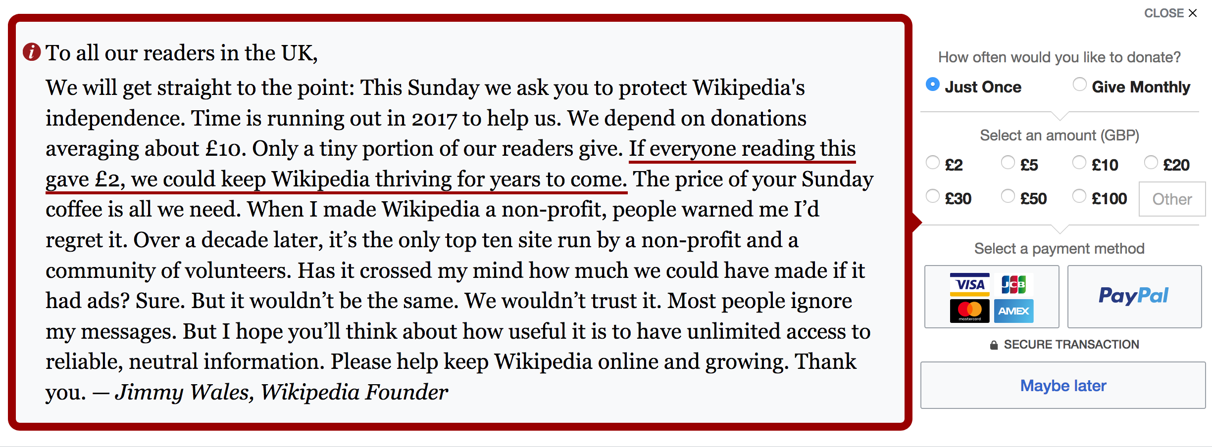
Check out their current (winning) banner:

wikipedia's ask that breaks the rules

So much in here is totally contrary to current wisdom:

The banner is so intrusive

It’s massive. It’s obnoxious. It’s the definition of an interruption.

The negative social proof

It’s EVERYWHERE. ‘Only a tiny portion of our readers give’, ‘Most people ignore my messages’. What the shit!

I remember reading a post from fundraising legend Jeff Brooks back in 2013 explicitly calling out negative social proof in fundraising, even backed up by some science. Wikipedia clearly didn’t see it.

A ‘Maybe later’ button in the form

Everything I’ve read on optimising donate forms has recommended minimising distraction – anything that will take you away from the purpose of the form (read: hitting ‘Donate Now’).

(Clicking the ‘Maybe later’ button lets you enter your email address, and then you get sent an email reminder later on – it’s a very nice flow).

Look at all those options in the gift array

EIGHT choices.

Anchoring the ask lower than the average donation

At just £2!

(I’ve also had great success anchoring even lower – just £1/$1/€1. Always performed best in tests).

No actual question

There’s no ‘could you please donate now?’-type typical ask. There are a couple of statements (‘We ask you to protect Wikipedia’s independence’ and ‘Please help keep Wikipedia online and growing’) that feel conventional, but they’re not underlined or made more prominent in any way.

In fact, the only thing that stands out is this sentence, that’s like the parent-who’s-hoping-you’ll-read-between-the-lines (your room would look much better if it were clean you know): ‘If everyone reading this gave £2, we could keep Wikipedia thriving for years to come.’

lol – brilliant.

It’s a huge blob of text

And it’s not super easy to skim (except for the underlined bit!)

They’re also doing a bunch of stuff that’s totally best practice (the ask is a personal message from Jimmy, their text is huge and easy to read, and they know *exactly* what’s resonating with their audience).

All of this has come about through hundreds of rounds of refinement, down to the exact language, button placement, donation choices – the lot. Everything that you see there has been tested and is totally optimised to maximise their income.

And to me, it’s just a huge reminder to test everything – especially the conventional wisdom – because the rules might not apply to you. We’ve all got different audiences, and for you, the unconventional might just work out.

Just in case you couldn’t love them any more, they’re also super transparent about their fundraising – how they bring in money, what they’re testing, and when they’re rolling it out, how they spend their donations. It’s all available on the Wikimedia Foundation’s fundraising wiki page.

Love it, love it, love it.

So get testing.

Sign up for email updates

Back to the home page

A solid gold time saving tip

I’ll let you in on a solid gold tip. This could save you tons of time and make tons of cash: test last year’s fundraising winner again this year.  

This is true for all channels.

If it’s an email, test sending the message to the test audience again as a reminder. You could try with or without a little topper. Or with a reply-style subject line (re:) vs. a new one. So many options. If that works, try sending a third time.

You just might have a winner on your hands again this year, for very little work.

This article covers some of the main arguments in favour of repetition pretty well, but here’s a quick summary:

  • Most people didn’t even notice you sent anything (think of how many marketing messages you’re getting at this time of year)
  • People aren’t paying attention to you UNLESS you repeat yourself. Repetition is one of the key drivers of success in for-profit marketing comms!
  • If a handful of people are complaining, develop a plan just for them (and remember, complaints can be a good thing)

One last tip: remember to focus your efforts right now on what will give you the biggest bang for your buck. Got an email list that responds well? Active Facebook community? Focus there first.

ACLU: smashing it

Quick thing first: If you signed up for my email list in the past week, it may not have worked. Please try signing up again! Sorry about that.

The ACLU is one of my favourites right now and their year-end video made me feel. I felt angry, I felt hopeful, and I felt part of something bigger.

Their whole year-end donation message starts with ‘Thank you’. Shit that’s great. They get their audience, and I’m sure this is going to cap off a fantastic year of work for them that their donors enabled.

Check it all out here.


(Thanks to Anne who tipped me off, this is so cool and great way to cap off the week!)

Buttons are good – use them

Buttons are an excellent way to get people to click and take action.

If you’re not on your work computer right now, you’re almost certainly reading this on your phone.

Most of your online stuff is being looked at on mobile phones right now.

You need to make it easy for people to take action. So put in a massive button when you want someone to do something.

Your supporters, especially donors, are older than you think – “young” donors right now are aged between 50 and 70, and we’re getting a lot better at using bigger fonts. But then we go and use text links or radio buttons all over the place and our sites look super 90s.

Put big buttons in to help out. And test out where to put them in.

Like this (don’t click any of them though, they don’t go anywhere):

No excuses: test your email fundraising appeals

Most of us are entering crunch time right now, and will be flat out emailing our supporters until the year-end.

You have no legitimate excuse to not test* how well your email fundraising appeal will perform before you send it to everyone on your list.

Here’s a simple process I tend to use when I’m testing out emails:

  • Write two or three different emails
  • Send all three at exactly the same time to a small part of my list – enough to get a statistically significant result
  • Project which one will perform the best**
  • Test the top one or two again to a bigger audience to make sure it wasn’t a fluke (and ditch the worst performing one)
  • Send to the full universe

Here’s the thing that’s painful but WILL make you a better fundraiser:

Don’t send anything that doesn’t meet your minimum baseline. Go back to the drawing board and try again until you get it right.

Don’t send anything that isn’t inspiring people into making donations to you. In direct mail, you usually find that out too late – but there’s no excuse for having an under-performing email.

Here are some starting points of things you could be testing:

  • Subject lines (and this should be every single time as a bare minimum – I’ve seen good subject lines getting 8 times as many donations as the worst performing subject line. And remember, you’re looking for the best action rate)
  • Lede – is there something in the news that’s relevant to you and giving your appeal some urgency?
  • Images
  • Email layout (buttons!)
  • Language
  • Suggested donation amount

There’s a lot more you can experiment with, but these will give you the best bang for your buck.

You owe it to the people your organisation is set up to help to get this right.


*I wrote a big testing guide and posted it the other day – check it out here.
**I’ve got a post on its way about how to do this too.